The Sportsplex's New Visual Brand
Dartmouth pride runs deep through the Zatzman Sportsplex—it always has, and always will.
Maybe it’s the waterfront views or the gorgeous green spaces that make you proud to live, work, and play in Dartmouth. Perhaps it’s the community’s rich history—including its buildings, businesses, accomplishments, and people—that make you beam with pride to say you’re a part of it all. For us, it’s all the above. 
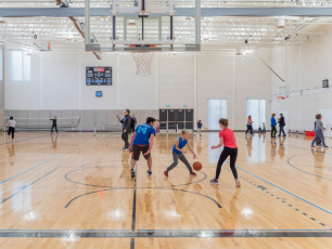
Our proudest achievement over the past three decades is being Dartmouth’s hub for active living, social opportunities, and recreation. In creating the new visual brand and identity of the Zatzman Sportsplex, we spent time reviewing and learning more about the facility’s background, through information provided by the Board of Directors, staff, and Dartmouth’s residents. We also considered our future and how we want to fit into the community going forward. With a name like the Zatzman Sportsplex—a tribute to a man and family that have made such an impact on Dartmouth—and a vision of a more welcoming, inclusive, and thoughtful space, we knew the brand had to reflect everything we’re working toward (and the people we’re doing it for).
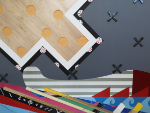
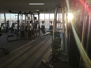
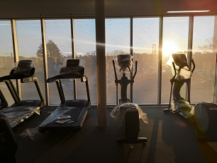
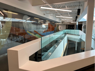
Our new logo was designed with Dartmouth and its people in mind. The first thing that pops out when you look at our new logo is the simplified view of our fitness centre, which overlooks Wyse Rd., the Halifax Harbour, and the Macdonald Bridge. An iconic architectural piece of our new facility that overlooks one of the busiest roads in our community, we knew this image would be recognized widely by residents and visitors alike. The building’s structure is then juxtaposed with the merging retro-inspired shapes—a nod to the facility’s long history of being an intersection of activity, creativity, and wellness.
As for the green and blue in our logo and branding, they represent more than just the colours that cover our facility’s walls and windows.
Green is a nod to the urban green spaces, including the Dartmouth Common, that make our community a beautiful place to live. The Common is a park that’s physically close to us, but also near-and-dear to our hearts. From hosting yoga sessions in the park to encouraging users to take their active living outside, we love having this beautiful, lush space beside our facility.
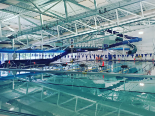
 Blue symbolizes the water that surrounds our community, as well as the water in our pools. Being near the water (like Lake Banook and Albro Lake) is a big part of living in Dartmouth, and offering a safe, fun place to play in the water is a big part of what we do.
While we know the facility’s new name, logo, and visual brand are a prime representation of Dartmouth and everything it’s about, we wanted to tie everything together with a tag line dedicated to our community. “Dartmouth Fits Here” is a testament to the continued support the Sportsplex has received over the past 30 years. The Zatzman Sportsplex is a space dedicated to supporting healthy minds, bodies, and spirits in Dartmouth—and we’ll strive to be your resource for active living, wellness, and community for years to come.

